The data for this project is from an article by Bandelos, Finney, and Geske, titled, A Model of Statistics Performance Based on Achievement Goal Theory. The purpose of the study was to explore how different student characteristics and learning strategies related to achievement in a statistics course. In their study the researchers used SEM techniques to analyze the data. We examined the data using PCA and Factor Analysis techniques.
The variables were: Effort: Time spent on homework. Achieve1: Students’ midterm exam scores (standardized into z-scores). Achieve2: Students’ final exam scores (standardized into z-scores). Lgoal: Learning goals as measured by survey (learning goals inventory) – Ex: I enjoy challenging assignments. Perfgoal: Perfomance goals as measured by survey (same survey, different items) –ex: I like others to think that I know a lot. Efficacy: self-efficacy in statistics, measured by the MSLQ instrument (survey). Anxiety: a measure of test anxiety, the ‘worry scale’ from a survey instrument. Depproc: called ‘deep processing’, a learning strategy also measured by the MSLQ (survey). Disorg: a measure of disorganization, also measured by the MSLQ (survey).
1 Principal component Analysis: Table 1. Eigenvalues
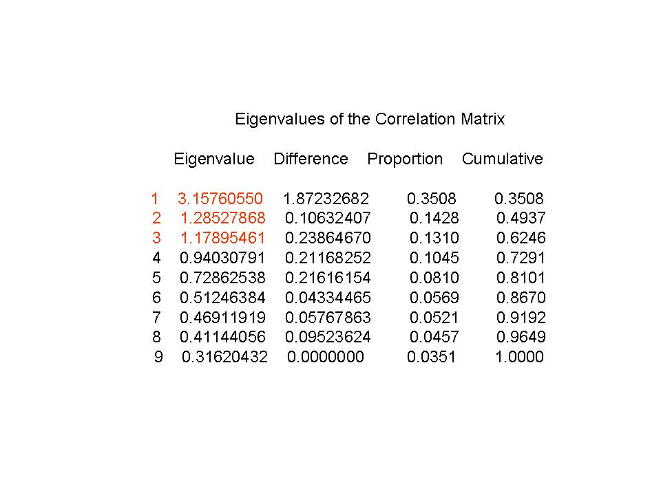
From the eigenvalues table, we see that the number of eigenvalues greater than 1 are three. However, the cumulative percent of variance explained for three components is 62.5%. If we wanted to use the 80% rule, we would need 5 principal components. So, our PCA analysis indicates somewhere between 3-5 principal components should be used. We will use the eigenvalue > 1 rule, and select 3 principal components.
Table 2 Eigenvectors
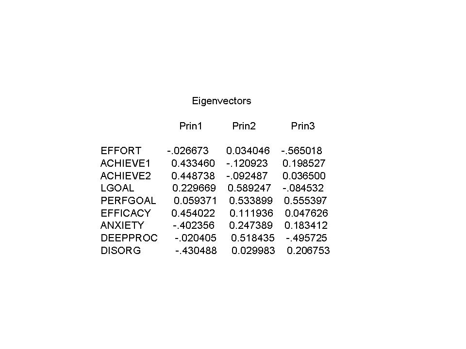
PC1, is a contrast between Achieve1, Achieve2, Efficacy, and Lgoal vs. Anxiety and Disorganization. PC2 seems to represent a combination of Lgoal and Perfgoal, as well as Deepproc. PC3 is the contrast between effort and deepproc vs. perfgoal. PC1 makes sense, because the achievement scores are highly related, and one would expect higher scores on the exams to show higher efficacy (self-confidence in class), and be interested in learning lots of material, and would expect students to be less anxious about class and be more organized (the opposite of disorganized). In PC2 we have high learning goals would be expected to have high values on performance goals. You would also expect students that want to perform well to be more likely to use learning strategies, such as deepproc. PC3 doesn’t seem to make any sense, since we would expect students with larger perfgoal scores to be more motivated, and thus put forth more effort. We’re not sure why this is happening.
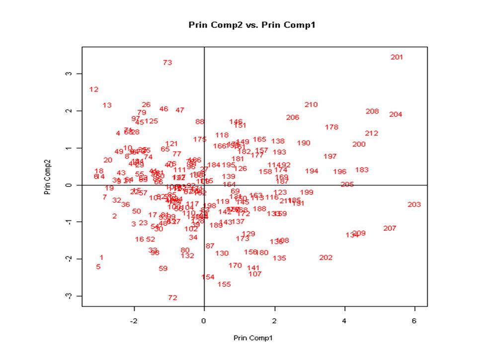
Outliers: Using these graphs we can see several potential outliers. For example, looking at principal component 2 vs. principal component 1 graph (Figure 1), 73, 201, and 203 appear like they might be outliers.
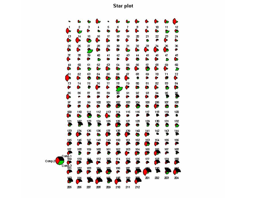
Patterns: For principal component 1, we see that most of the larger id number tend to be more toward the right side of the 2d graphs, and the smaller id numbers tend to be toward the left side of the graph. This pattern is particularly evident in the star plot (Figure 2). The experimental units near the bottom of the star plot have larger values for principal component #1 (colored in black). We are not sure why this pattern appears. 2. Factor analysis
Table 3 Factor analysis Significance Tests Based on 212 Observations
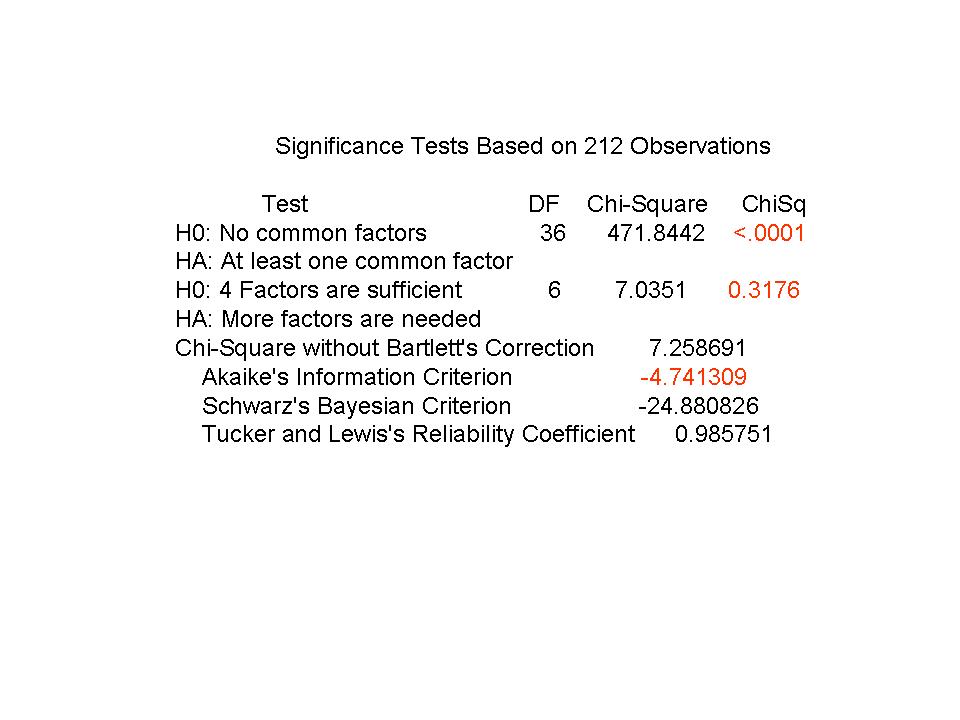
Table 4 Communality estimates
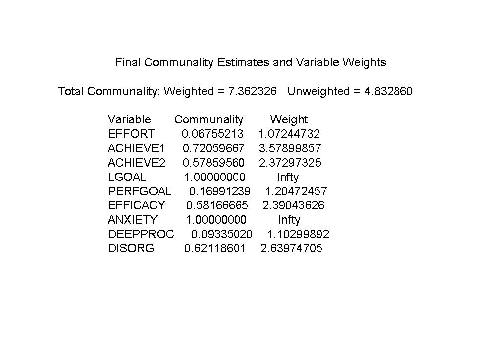
Table 5 Rotated Factor Pattern
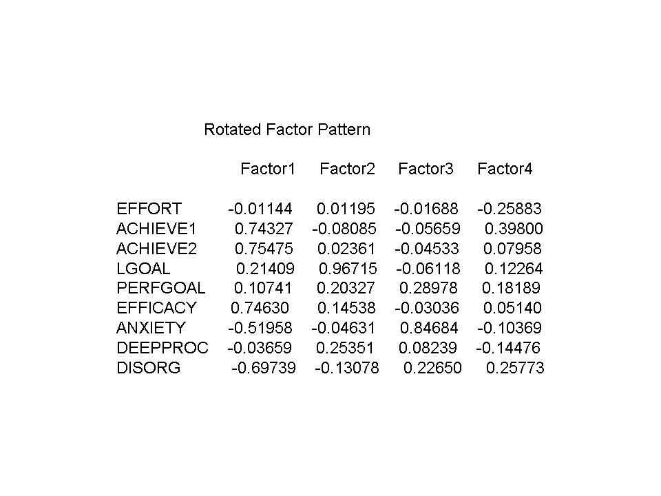
Discussion: Factor 1 seems very similar to our first principal component that we found in part #1. It might be interpreted as an overall ‘measure of achievement and how a person feels about achievement’ – if you have large achievement scores, you have high efficacy, low anxiety, and low disorg score (which is related to participation partly). Factor 2 might be interpreted as a ‘course goals’ factor – represents how much a student set goals for learning and performance, and the learning strategy of deep processing, and was contrasted with disorg, which can represent participation somewhat. Factor 3 might be interpreted as a ‘anxious about performance’ factor. This factor makes sense because students that are highly anxious about the course would also be concerned about their performance in the course, and tend to have higher disorg scores (so don’t participate in class as much, or pay attention as much because they are so anxious). Factor 4 could not be interpreted.

Discussion: Patterns: Looking at the star plot, most of the blue and green values (factor 3 and factor 4) are near the bottom of the chart (Figure 3). We can also see that there are not too many units with large values on factor 3. There are, however, a few experimental units that have very large values on factor 3 (e.g. #25). Factor 3 is an anxiety about performance factor, so it is pleasing to see that most students do not have large values for factor 3. It is also interesting to see that although more of the green appears near the bottom of the chart, not everyone that has anxiety ends up with low factor1 scores, so that should be of some consolation for students that have anxiety.
Clusters: There seems to be a cluster of students in the ‘middle’ of the graph that have reasonably good scores (slightly above average) on factor1 (achievement and how you feel about achievement) and reasonably good scores on factor2 (course goals), indicating that in general students did fairly well in class and felt pretty good about it, and had some goals that they had set for the course. This cluster also does appear to have about average values for factor3 (anxious about performance). You can also see this in the star plot, there are many experimental units that have both values of red and black that are both medium (e.g. see #18). Since we can’t interpret factor4, the size of the markers is difficult to interpret in the 3d graph as well. Outliers: Some of the same experimental units appear as potential outliers. For example, #203 has low scores on all factors, so they probably had limited goals, low grade, and low anxiety. This might represent a person who didn’t care about class or their grade, didn’t show up, and not surprisingly, received a low grade! It is also interesting to see that unit 73 doesn’t appear as much as an outlier as it did before, though it still has some potential.